Exporting SVG icons for the web
I chose the theme for this website with one goal in mind: simplicity. It’s a simple theme, it’s simple to add content and the setup was simple. Great! This website will likely change and evolve a lot over time. I chose this theme to circumvent the analysis paralysis that I run into while optimising for the future.
So what?
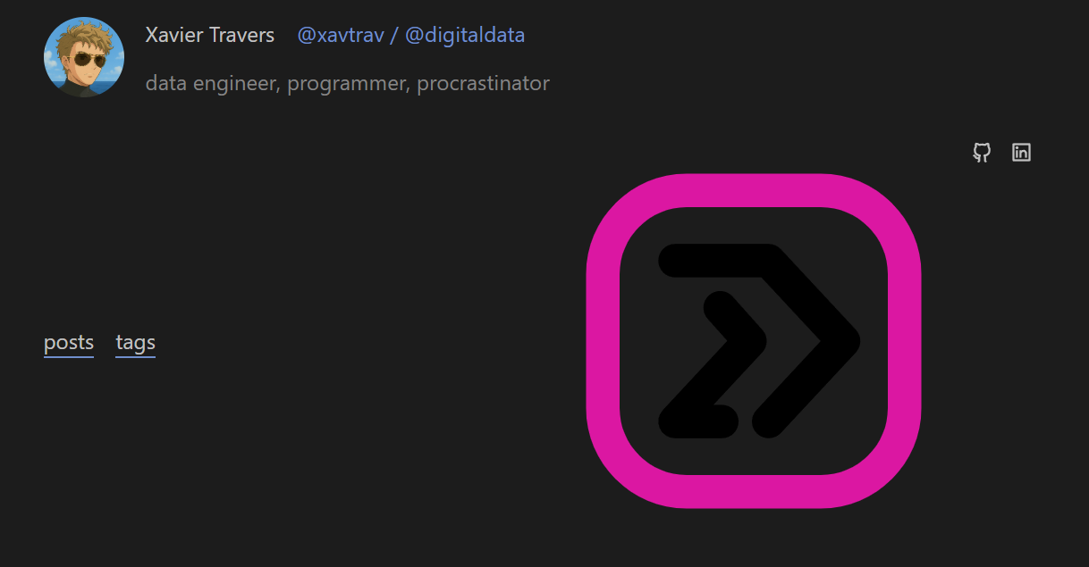
One of my favorite aspects of serene is this profile header/banner on the homepage.
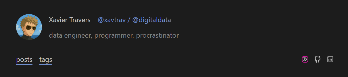
You may/may not have noticed one of icons on the right has a pink outline, and links to my old p5.js portfolio website, <code>digital. I wanted to include a nod to my previous work that was stylish, but matched the style of icons used by the font. This was apparently, not a simple goal to achieve.
I must admit I spent more time on this than I expected to.
Matching the icon style
The serene theme uses Remix Icon for the logos included. These have a clean outlined look. My original <code>digital website logo would stand out like a sore thumb.
 I was and still am quite fond of a pixelated aesthetic.
So to match the style of Remix Icon, I needed to:
- Vectorize the icon with an outline style.
- Save it to an SVG format similar to Remix Icon’s.
Sidequest - Relearn vector-art software
I have been trying to remove subscriptions and open-source-ify my software library of late. I may post about this.
Either way, as part of this goal, I wanted to try Inkscape. I have Affinity Designer 2 and have never had an issue before, but I thought, “if I need to relearn the software anyway, why not learn the free/open-source software that won’t require me to pay for a new update.”
To cut a long story short, I got a bit overwhelmed with the user interface, and was concerned that this would eat my day just to add a simple icon to my website. you may learn that I still managed to spend a lot of time to add that simple icon. Either way, I decided to check if I still had some Affinity Designer 2 muscle memory (or even if the UI was just a bit more user-friendly)… I cannot understate how much more intuitive the user interface felt. This could just be because I used the software before, but it just seemed to click with me. So, as much as we love the free and open-source software out there, one must appreciate the value of having a business with funds to spare on proper user experience design/research.
#notsponsored
Anyways, with the icon .svg in hand, I went to add it to the website.
Serene makes this easy: simple add the image to the static/icon/ folder and refer to it by name in the links front-matter in your homepage index.
1 2 3 4 5
All good, right?
Here is what I saw:
- The size was way too large.
- The colour of the arrows was dark on a dark background.
Fixing the icon
At first I thought that Affinity Designer 2 would have an export option specifically for the web, with scaling options and such. Alas, I am not so lucky. So I needed to dive into an example Remix Icon and compare it with what I had.
I noticed the following differences:
1
2
3
4
5
6
7
8
9
- There was an
xmldeclaration. Seemed redundant given it’s a.svg. - There was a
!DOCTYPEtag. Also redundant. - The
svghad both its width and height set to100%. That may be a source of the sizing issue. - The
pathtags in the arrow group (highlighted lines 6-7). This needs afill="currentColor"attribute.
Now I could have addressed all of these issues manually and called it a day. I probably should have. Instead, I decided that I may want to do this again, so I built a Python script.
Python’s xml library tries too hard…
… and sucks as a result.
I really struggled with extra “useful” information being added to the XML after being parsed by the xml.etree.ElementTree.
For example, I had to manually remove the namespace before parsing the content of the .svg or I would get have every tag prefixed with a random ns0 namespace. I could not find a argument, flag, or function, to disable this “feature”. In the end it was just simpler to remove the xmlns="http://www.w3.org/2000/svg" before passing the file content to the parser, and to just add as a parameter after parsing.
There were plenty of these idiosyncracies I had to account for before I could get a simple parser script working. Another such situation I had to deal with was the formatting the XML object with indent (for display purposes) causing the resulting output to permanently keep indentations and new lines. Not very nice if I just wanted to keep the content minified. It was a minor issue, but it felt like there should have just been an interface with pprint or some unparse function with arguments to configure indentation.
Either way, the display issue is fixed after running the script. I recommend against using the Python script as I have since created a small website to do this, with better configuration options.
Javascript handles XML formats better
I rewrote the above functionality using with an HTML form and a simple client-side script in Javascript. Javascript handles XML (and therefore SVG) file formats in a much more intuitive way. This makes a lot of sense since one of the language’s key usecases is manipulating the HTML (a tag-based XML-like markup language) via its Document Object Model API. This API has been extended to support SVG modification.
You can view and use the SVG-for-web converter here.
As you’ll see when looking at the header on the live page, the recommended options (as well as applying a width and height of 18) work perfectly to help me create my own SVG icons for web use.
Why did I write this up?
I spent so much time on this just to get an icon working, so I felt that I should milk the experience a little.
Here is what I learned in the process:
I need to start picking my battles better. I need to build a point of reflection into my work style in order to prevent going too deep into these rabbit holes where the payoff may be minimal. This will be a tough habbit to crack. While writing this post, I almost fell down the following rabbit holes:
- Can I convert the header/banner into a shortcode that I can paste in any of my markdown files? Why would I ever need this again?
- Where did Javascript originate? What was its original purpose? I only needed this information for a certain expression I wanted to use (and didn’t, in the end). No need to go deeper if the information did not match what I was looking for.
Just write the damn post. Even if I think it’s wrong/useless work. I was debating whether to write this up today at work. My reasoning to be so dismissive was:
- I made the assumption that, while Affinity Designer 2 does not have an “Export for web icon” settings menu, Adobe Illustrator probably does. I have not checked this assumption. This article and resulting online tool would therefore not be as useful enough to merit a write-up.
- Perhaps I had over-engineered or re-engineered this solution. There is very likely a better tool out there to prepare SVGs for use as web icons.
However, I stormed ahead and wrote the post. I reaffirmed that I actually had good reasoning for the scripting decisions that I made, and feel a sense of pride as I reflect on this post.
My writing skills need work, and that’s okay. This post might read like a jumbled mess, and that is absolutely fine. Not only is this dev-blog meant to provide me with a dumping ground (deliberate word choice) of my thoughts, but I will definitely improve on my writing as I practice. You don’t get anywhere without that first step.
I hope you’ll bear with me and I’ll bear with me as I continue.
Cheers,
Xavier